Client: Chick-Fil-A
Visual Identity System, Environmental Brand Messaging,
Initial Ideation, Concept Design, Interior Branding, Graphic Design
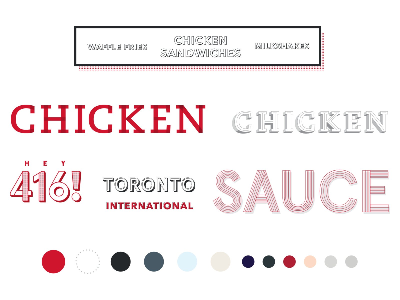
To convey the Chick-Fil-A Brand in a new international market, I unified the brand look while staying true to the Chick-fil-A core feel & design principles.
A new 'Kit of Parts' was created that can be applied to new urban restaurants across cities Canada and the United States including New York.
Pattern
Type Treatment & Pattern
Iconography
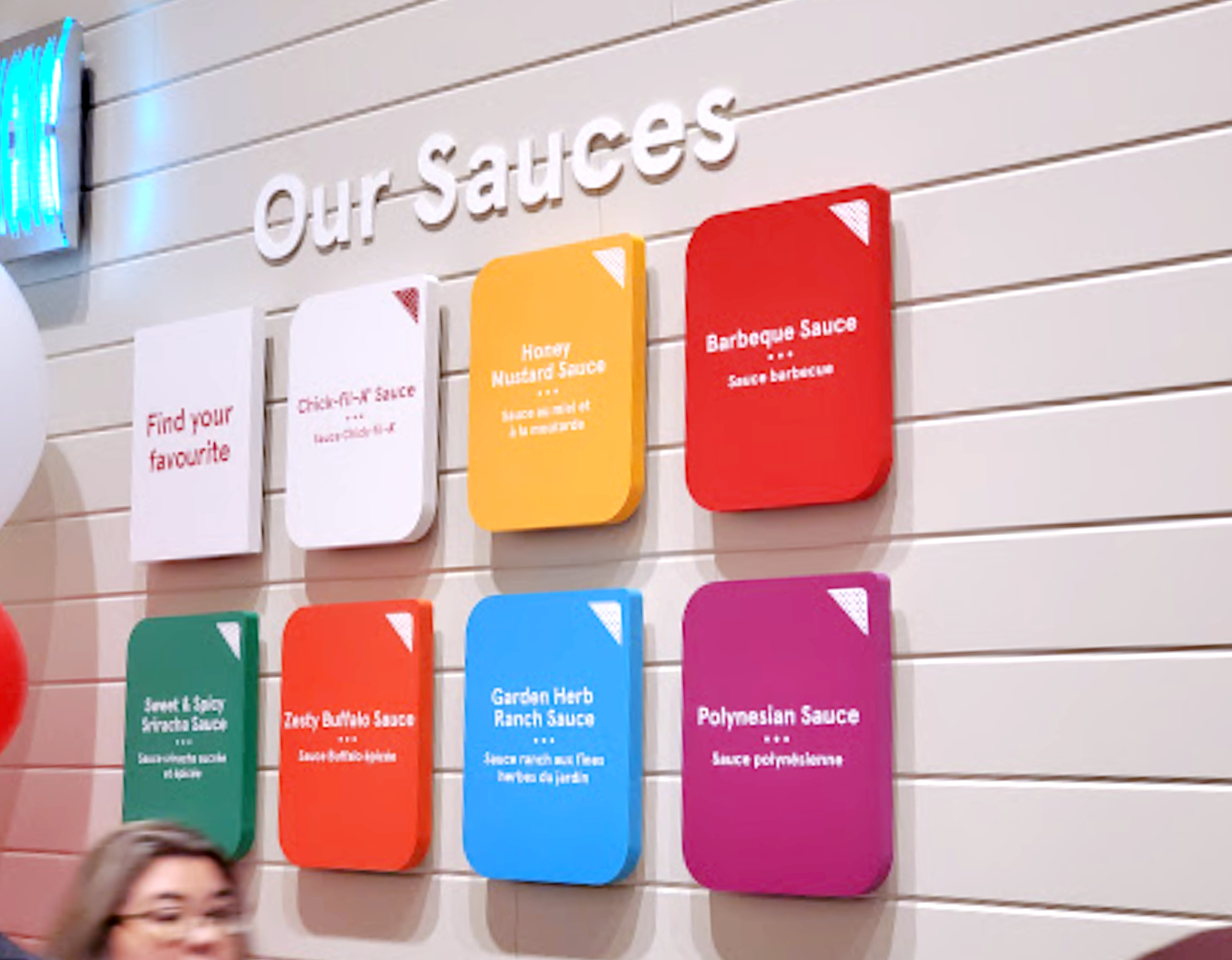
In Store


